DINED
Designers want to design products that are usable. In the case of physical products that means they should have the right dimensions. It's therefore necessary to use anthropometric data — measurements of the human body — when designing products.
DINED is an online set of data, tools and resources to apply anthropometry in design. At its heart lies a large database of human body measurements gathered by researchers at Delft University of Technology. The tools and resources around it are designed to make it easy for designers to use this data in their projects.
While responsible for DINED I updated the design and technology to better fit this goal and to support future improvements and features. I designed and developed several new tools.


Redesigned structure to improve accessibility and allow new features
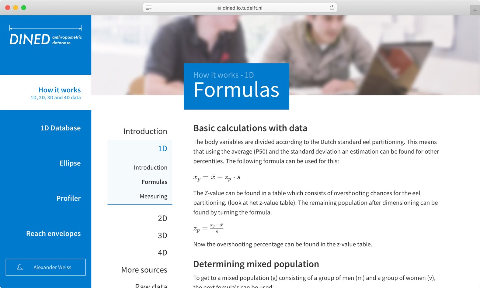
DINED started primarily as a database. Over time, information about how to use it was added. The resulting website was text-heavy with key tools spread throughout. By thinking of DINED as "a set of resources" I created a much simpler structure. The tools took centre-stage and the text-heavy website became one of the resources. Making everything easier to find and allowing the addition of new tools.
Tools designed specifically to aid designers and researchers
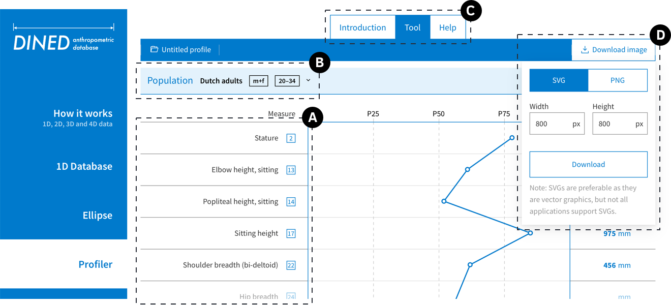
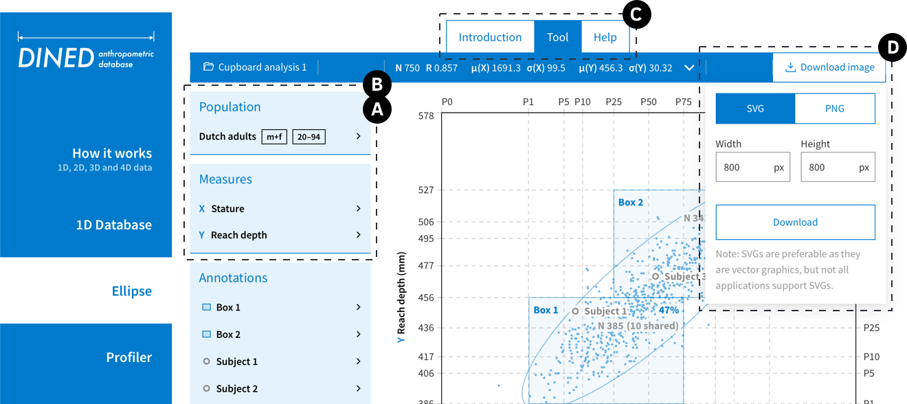
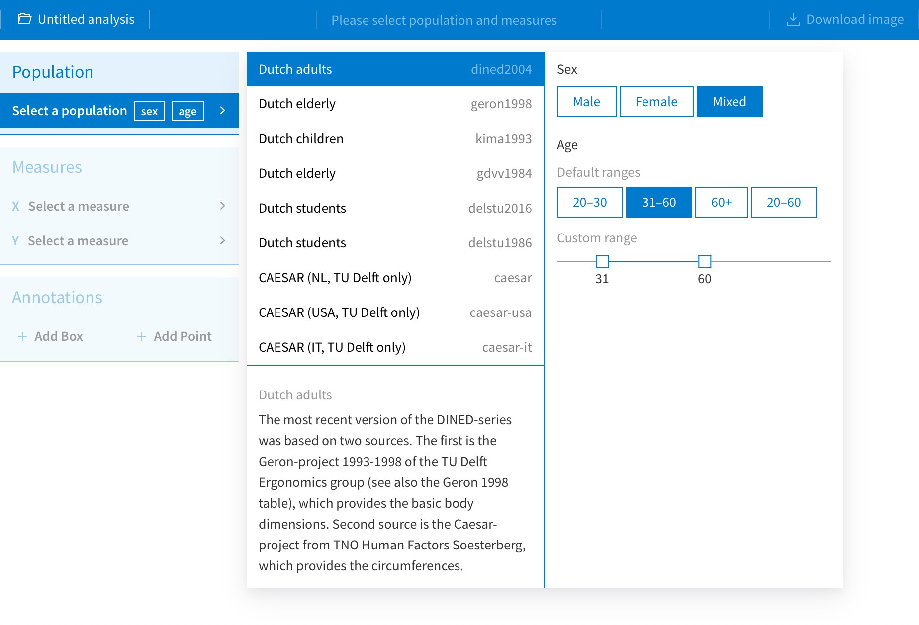
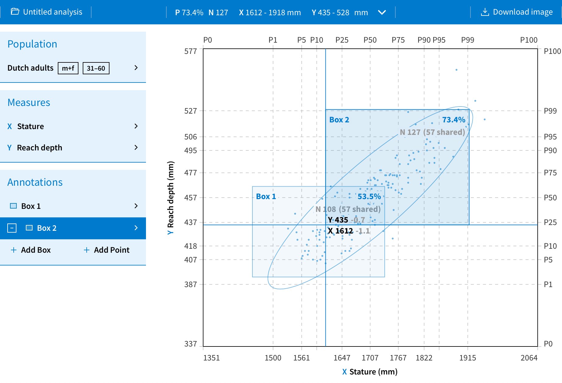
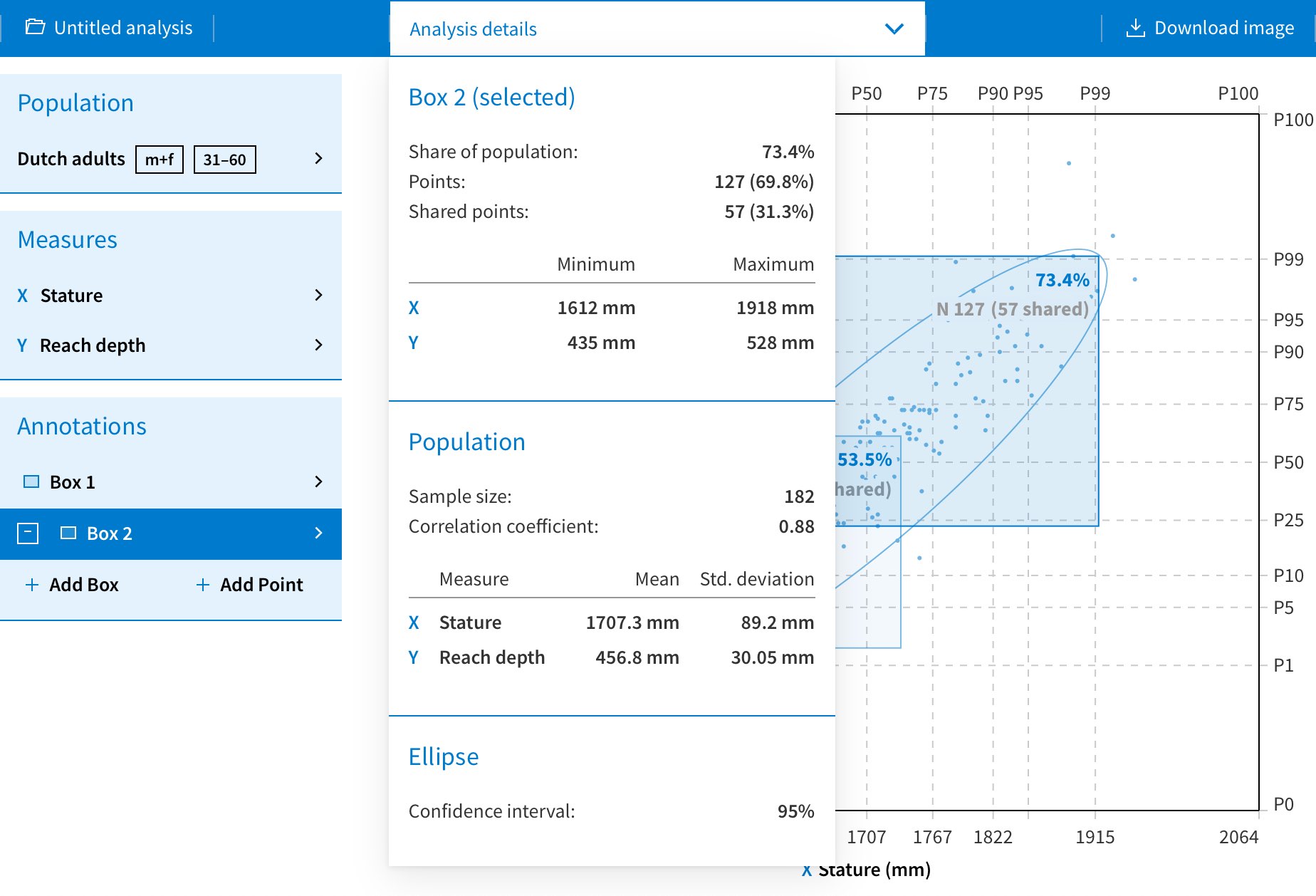
Statistics can be tricky — you need to know what you're doing. DINED's tools provide useful information without requiring much knowledge about statistics. Each tool hides the tables of data and maths behind an easy to use interface tailored to a specific use-case. Simple inputs result in easy to understand output that can be readily used for making design decisions and further analysis.
Good usability for experts and beginners through consistent components and patterns
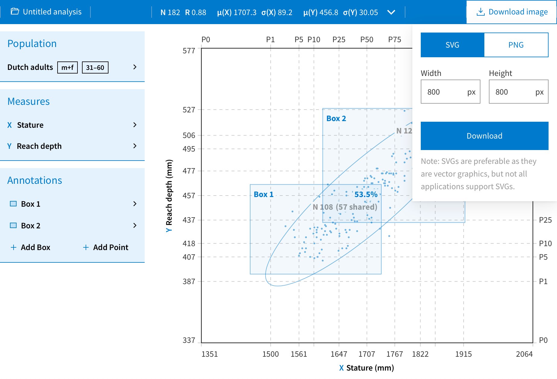
While each quite different, all new tools were designed with the same patterns and components: they all use the same popovers for selecting datasets, saving results, etc; and all tools share a similar layout with data input on the left, viewing in the middle and saving on the right. In addition, new users are presented an introductory page before opening a tool and documentation is always easily accessible. All of this is meant to make the tools easy to use for both new as well as existing users.