Nerdalize


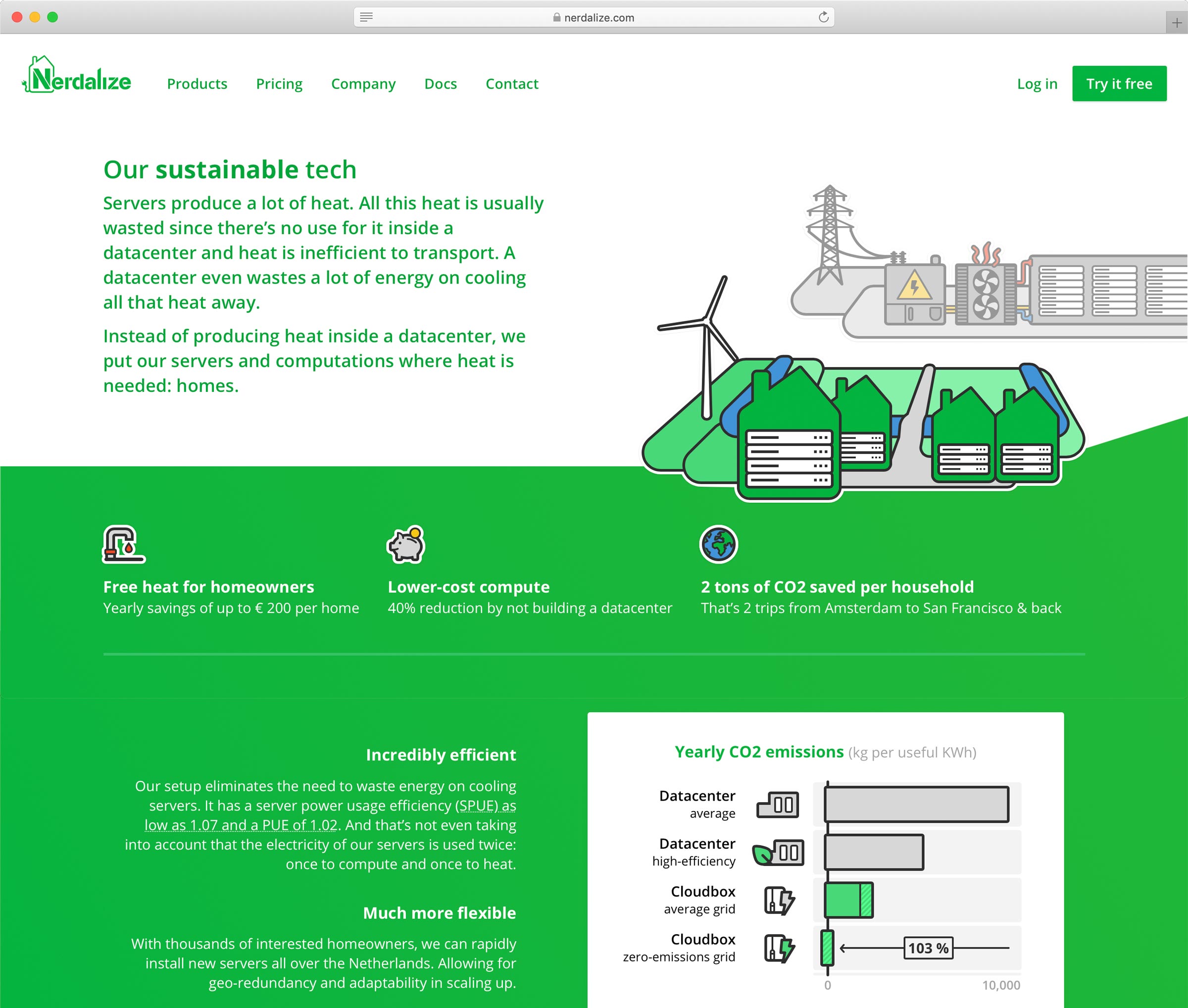
Datacenters house the millions of servers that run the internet and the “cloud”. Already using about 1% of the world's electricity, their energy use is rapidly increasing. Nerdalize built a sustainable cloud with servers in homes, where the heat from the servers is reused to heat homeowners' water.
The Nerdalize brand, inspired by the stickers on the Nerdalize team's laptops, is designed to fit the company's nerdiness, be approachable and to stand out in the cloud market. The Nerdalize website builds on it to communicate the company's unique story & technology. And is designed to help both people already comfortable with running applications in the cloud and those new to it to get started using the sustainable alternative.
Apart from designing the brand and developing the website, I worked with a small team to design and build most of Nerdalize's touchpoints including e.g. emails and the management portal.
 Website structure
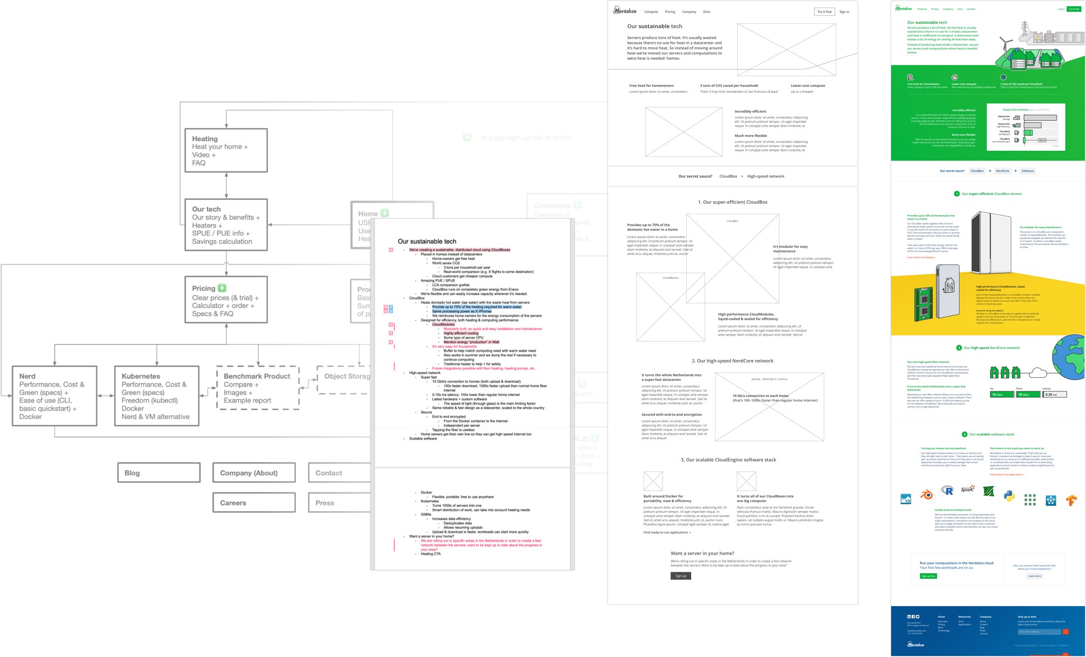
Page outline
Wireframe
Detailed design
Code, review/testing & publication
Website structure
Page outline
Wireframe
Detailed design
Code, review/testing & publication
The planned structure for the website was defined in a flowchart. This allowed us to prioritise pages and work on the website iteratively. Each addition or update followed a consistent process, starting with content research to create an outline of the page. This would then be used to create wireframes and, after some iterations, detailed designs. While getting implemented the design was further tweaked and the responsive behaviour created. After (usage) testing and review, final tweaks would be made and the update published.
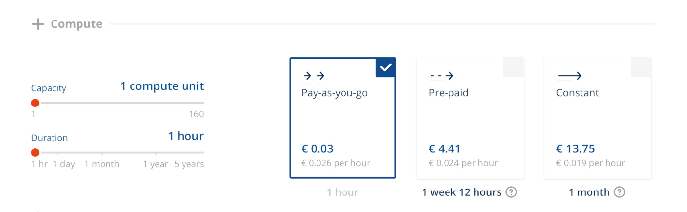
To help communicate the story and delight users, the website contains many small details. These range from unobtrusive animations in illustrations, to icons in the pricing calculator that scale with the input values. And from allowing simple calculations in input fields (with — for fun — support for entering storage space in number of DVDs) to popovers in example code to explain individual commands.
A living guide to document the design system
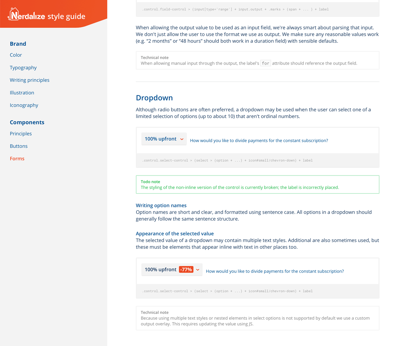
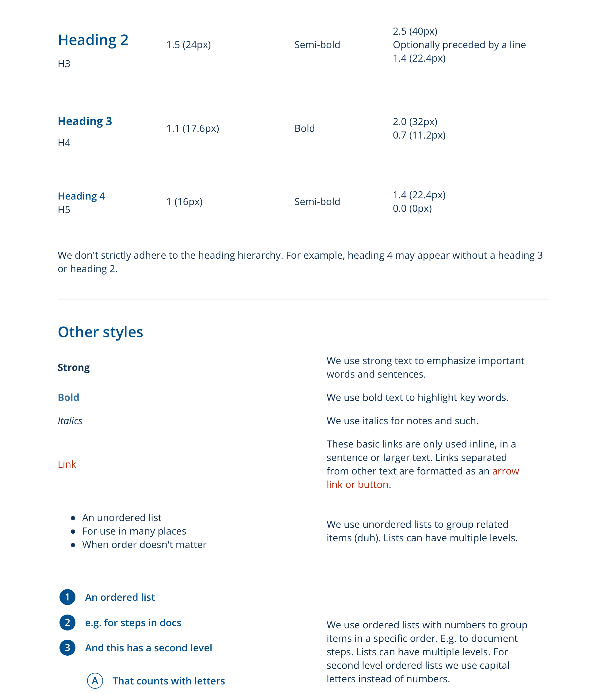
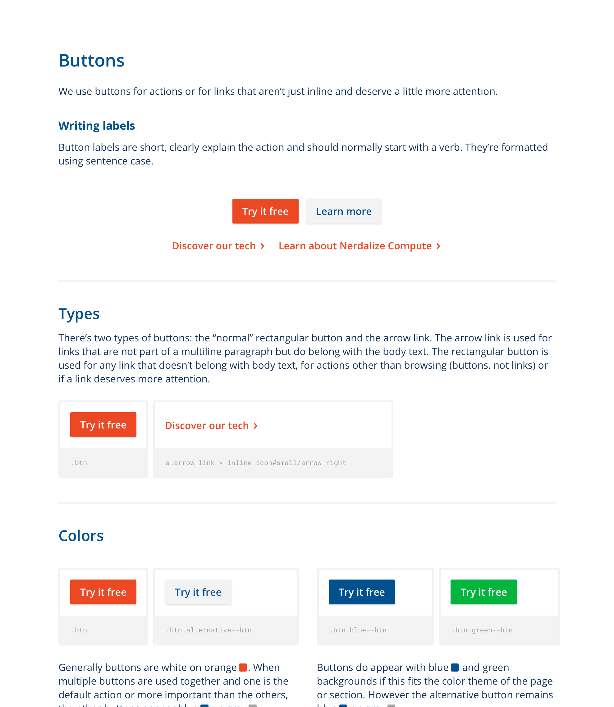
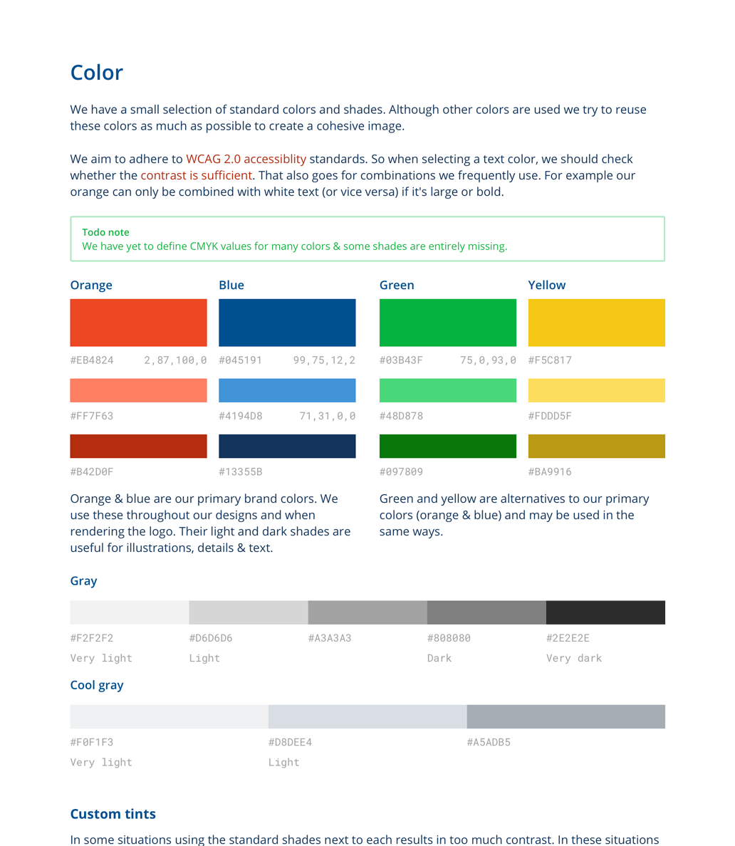
A style guide was used to keep the brand consistent across everything from website to t-shirts. It's a living document, evolving over time, and was designed to be usable by anyone inside or outside the company. It contains information about things like brand personality, colours and preferred words, but also includes a design system for UI patterns and components with live examples.